1 - The Enduring Legacy of the Coca-Cola Logo
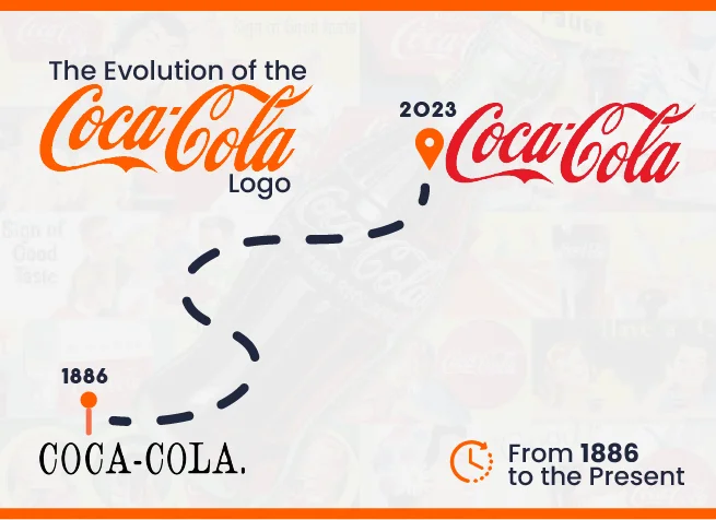
The Coca-Cola emblem hardly requires an introduction. The Coca-Cola Corporation and its iconic carbonated beverage boast one of the most recognizable brand images globally, featuring the ubiquitous red and white palette and distinctive script font gracing signs and store displays in virtually every corner. Just like Pepsi and Twitter’s logo evolution, Coca-Cola has undergone more than 1 rebrand over the years.
What adds to the intrigue of the Coca-Cola logo is its enduring resilience. Across a span of more than 130 years, the Coca-Cola emblem has undergone minimal alterations. In its inception, it reflected the prevailing design aesthetics of its era – a glance at contemporaneous logos reveals numerous flowing script styles, including the initial Pepsi logo, introduced only a few years later.
1.1 - Coca-Cola Logo: 1886
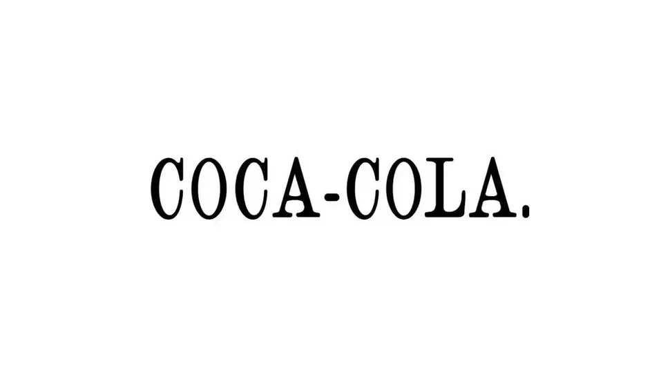
Introduced in 1886 by John Pemberton, Coca-Cola made its debut as Pemberton's French Wine Coca. However, in reaction to prohibition regulations, a non-alcoholic formulation emerged, and a fresh appellation was crafted under the guidance of Pemberton's collaborator, Frank Mason Robinson.
Robinson possessed the foresight to recognize the visual impact of the two C's in advertising, giving birth to the name Coca-Cola. Initial advertisements displayed the name in an unadorned serif typeface, complete with a period.
1.2 - Coca-Cola Logo: 1887
It was Robinson who also conceived the notion of crafting a logo using Spencerian script, a graceful writing style extensively employed in the United States for formal communication until the advent of the typewriter – a tradition that persisted until the early 1920s. He aspired to attain a striking style, and his proposal received unanimous approval.
During its nascent years, the Coca-Cola script underwent periodic adjustments, and promotional materials exhibited numerous adaptations. Nonetheless, the original rendition bore a resemblance to the contemporary Coca-Cola logo we are familiar with today, with the distinctive swash leading into the initial 'o' serving as the most conspicuous divergence at first glance.
1.3 - Coca-Cola Logo: 1889 and 1890
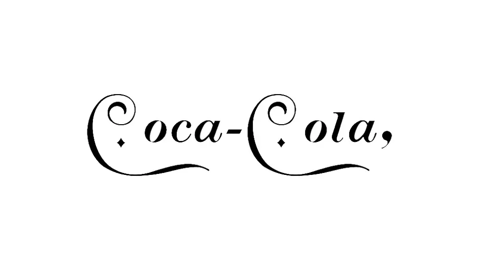
Even in its early stages, Coca-Cola demonstrated a penchant for occasional creative variations that caught the eye. In 1889, it embarked on an experiment featuring individualized letters, diamond shapes, and elongated tails, accentuating the prominence of the two Cs. Then, in 1890, it embraced the Art Nouveau trend, presenting the most radically distinct Coca-Cola logo witnessed to date, replete with graceful swirls and elements reminiscent of musical notation. However, it appears that this design was employed only once, gracing the company's inaugural calendar.
1.4 - Coca-Cola Logo: 1891
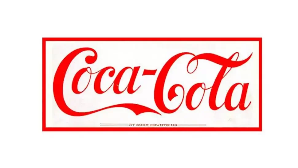
Coca-Cola's iconic color scheme is just as renowned as the logo's shape, and the incorporation of red didn't take long. As early as 1891, there were instances of the Spencerian script emblem rendered in red against a white backdrop. While the script remains somewhat distinct from the one we're familiar with today – with taller and more upright letters – it was already undeniably recognizable.
1.5 - Coca-Cola Logo: 1893
During the 1890s, the phrase 'trademark' was appended to the end of the 'C' in Coca, following the logo's trademark registration with the US Patent Office. It's noteworthy that the script closely resembled its initial design – foreshadowing the Coca-Cola logo we are familiar with today.
1.6 - Coca-Cola Logo: 1969
The subsequent development in the evolution of the Coca-Cola emblem was the incorporation of the white wave, officially denoted as a 'Dynamic Ribbon Device.' This wave, which is still employed today, made its debut in what would later be recognized as the iconic Arden Square, named after the cosmetics mogul Elizabeth Arden. Alongside the wave, the square introduced the term 'Enjoy,' supplanting the prior 'Drink' utilized in advertisements. A single word that went on to establish itself as a distinguished element of the Coca-Cola brand for an extended period
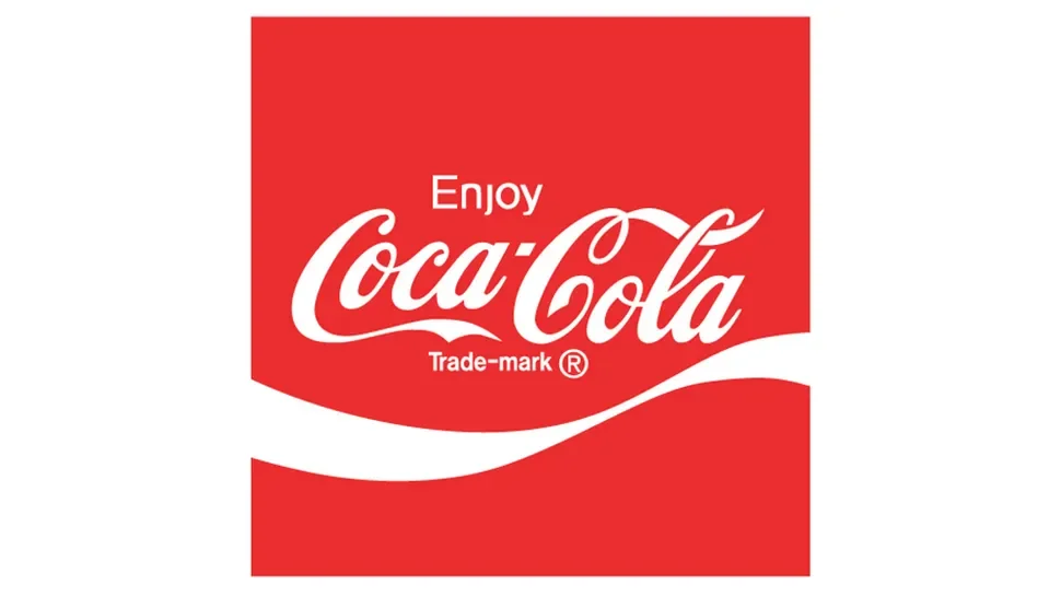
1.7 - Coca-Cola Logo: 1941
In 1941, Coca-Cola established an enduring design for its script logo. The distinctive leading swash within the 'o' of 'Coca' was eliminated, resulting in a more diagonal orientation of the letters and an overall improved balance achieved by refining the size and weight of each letter – including the reduction of the oversized teardrop terminal on the initial 'C', for instance.
The trademark information was also removed from the logo itself. Instead, it would be positioned underneath the logo in various applications, ultimately evolving into an 'R' at the end of the logo.
2 - The Coca-Cola Hug Logo
In 2021, a fresh and distinctive iteration of the Coca-Cola logo was unveiled for the 'Real Magic' campaign. Drawing inspiration from the way the Coca-Cola logo adorns its bottles and the concept of people embracing the Coca-Cola embrace was designed to symbolize authentic "moments of enchantment" throughout Coca-Cola's messaging. Heartwarming, isn't it?
3 - Present-day Coca-Cola Logo
The current Coca-Cola logo doesn't appear significantly distinct from the logo unveiled as far back as 1887. While the script underwent frequent modifications in its early years, it has remained unchanged for decades. Similarly, the white wave introduced in 1969 has endured, albeit with subtle alterations in its form. After dabbling with color variations, it has evolved into a more minimalist single white ribbon.
Just like Twitter’s logo evolution, The Coca-Cola logo stands as a remarkable illustration of how a logo can withstand shifts in trends and demands over the years. Many comparatively newer brands have undergone far more drastic logo transformations in significantly shorter timeframes
Remember to maintain consistency, keep the design simple and legible, and prioritize printability to ensure that your logo effectively represents your business in all your communications. Don't hesitate to get in touch or explore our services
